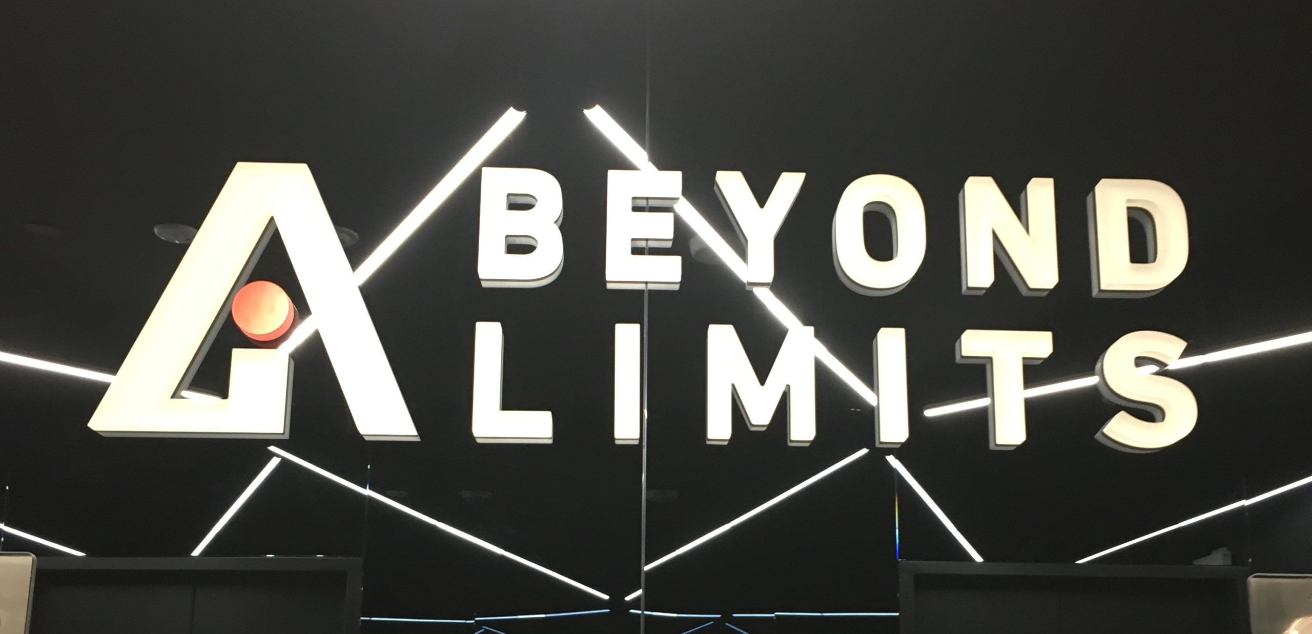
The most suitable lobby sign will incorporate elements which complement the lobby setting, corporate branding, the viewing distance, and the client’s budget.
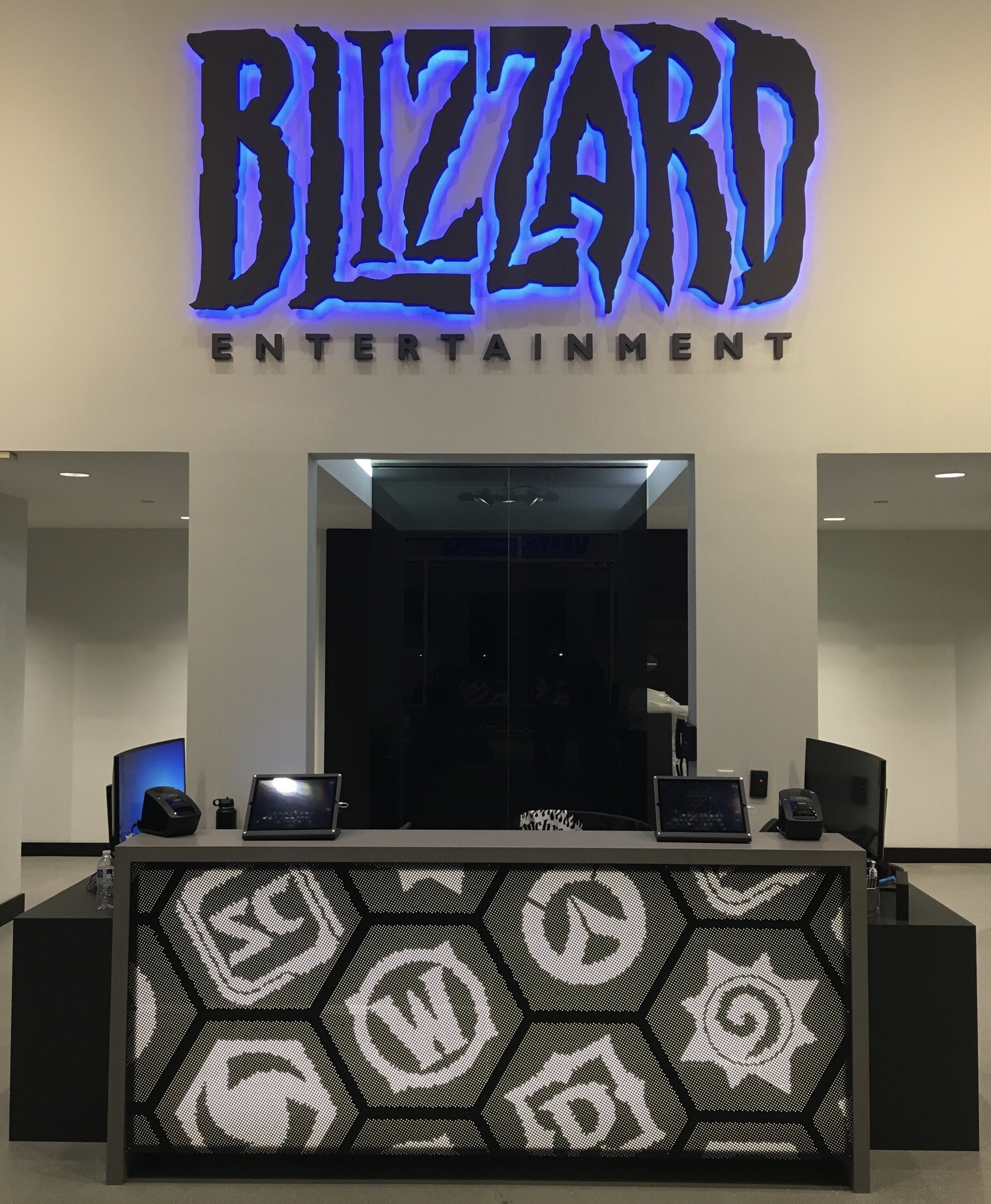
As a sign professional, the Consultative Sales Representative will automatically be asking themselves several questions as they begin assessing interest in a lobby sign. They will want to explore whether there are any potential obstacles or reasons why it might be challenging or impossible for the client to have or obtain a sign and if there are, will the challenges mentioned make it necessary for them to consult other experts on their team. They will want to know which wall the sign is being installed on (typically, whenever possible, it will face the entry door) and documenting the appropriate viewing distance and placement for this piece will be key. It will be important for them to understand what the client looking for. For example, will it be something showy or subtle? There will be a need to observe any design features in the lobby which might influence or conflict with the sign design (i.e., loud patterned flooring/wall coverings, stainless steel components, natural stone, artwork etc.). In addition, they will also want to make certain that the materials and colors to be employed are consistent with the décor of the office because visual contrast makes signage look out of place. They will pay attention to the lighting that is available in the area where the sign will be placed.
The client should expect the sales representative to ask questions as they explore the possibilities together and narrow down the options. First and foremost, they will want to understand the desired outcome so they will ask what your objectives for the sign are or the reasons why you have decided to acquire a reception sign. Knowing the client has likely been thinking about the decision they will ask questions like, “As you’ve thought about this what ideas have you had or what is most important to you?” They will want to know if you have discussed the project with anyone else and what they have learned about the process and what to consider. As with most custom work pricing is determined by various factors so the Sales Representative will want to know what sort of budget or price range the client had in mind. When it comes to design elements they need to know where viewers of the sign will be when they see and take in this sign. For instance, are they getting off the elevator, standing at reception, walking in the door, or waiting in the receiving area? They want to understand foot traffic patterns, so they inquire about the volume of visitors who come to your offices each week or month. It will also be beneficial for them to understand how aggressive your corporate profile is in comparison with competitive companies and how you want your signage to bolster your presence and corporation image. Lastly there will be a desire to understand how well known your logo and branding are and in what circles.
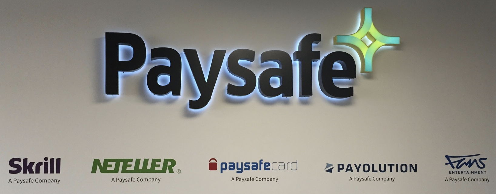
The physical space available is important and it impacts design and sizing in various ways. There will always be a “sweet spot” of visual impact for viewing the sign. In a lot of settings, that’s right when people walk in the door to the suite. In other instances, however, it may be when they’re standing at the reception desk. Reviewing this with the customer will help determine the overall size of the sign as well as how it may need to be lit (whether by internal or external means). Space available also comes into play as it relates to brand standards. Larger companies that rely on brand guides will be bound by rules for the minimum “white space” needed around a logo for ideal visual balance. As an average, most signs occupy 60-65% of the available width or height of the chosen wall space.
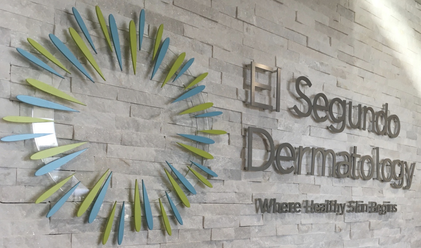
An existing client logo dictates the sign design process and the recommendations made to a client as noted previously with the branding guidelines. Beyond this, the intricacy of a logo impacts the sizing or material options presented. Items with fine lines or gradients aren’t suited for large Flat Cut Out lettering. For clear viewing, there are good and bad ratios of depth of return (thickness depth) to the width of the face of a sign. These factors impact balanced proportionality which is a key design factor.
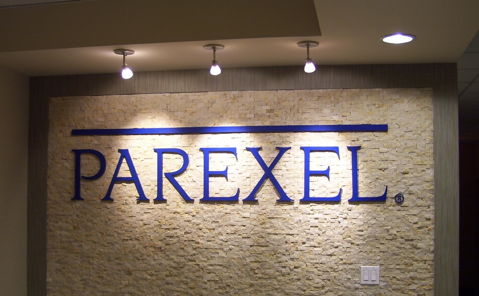
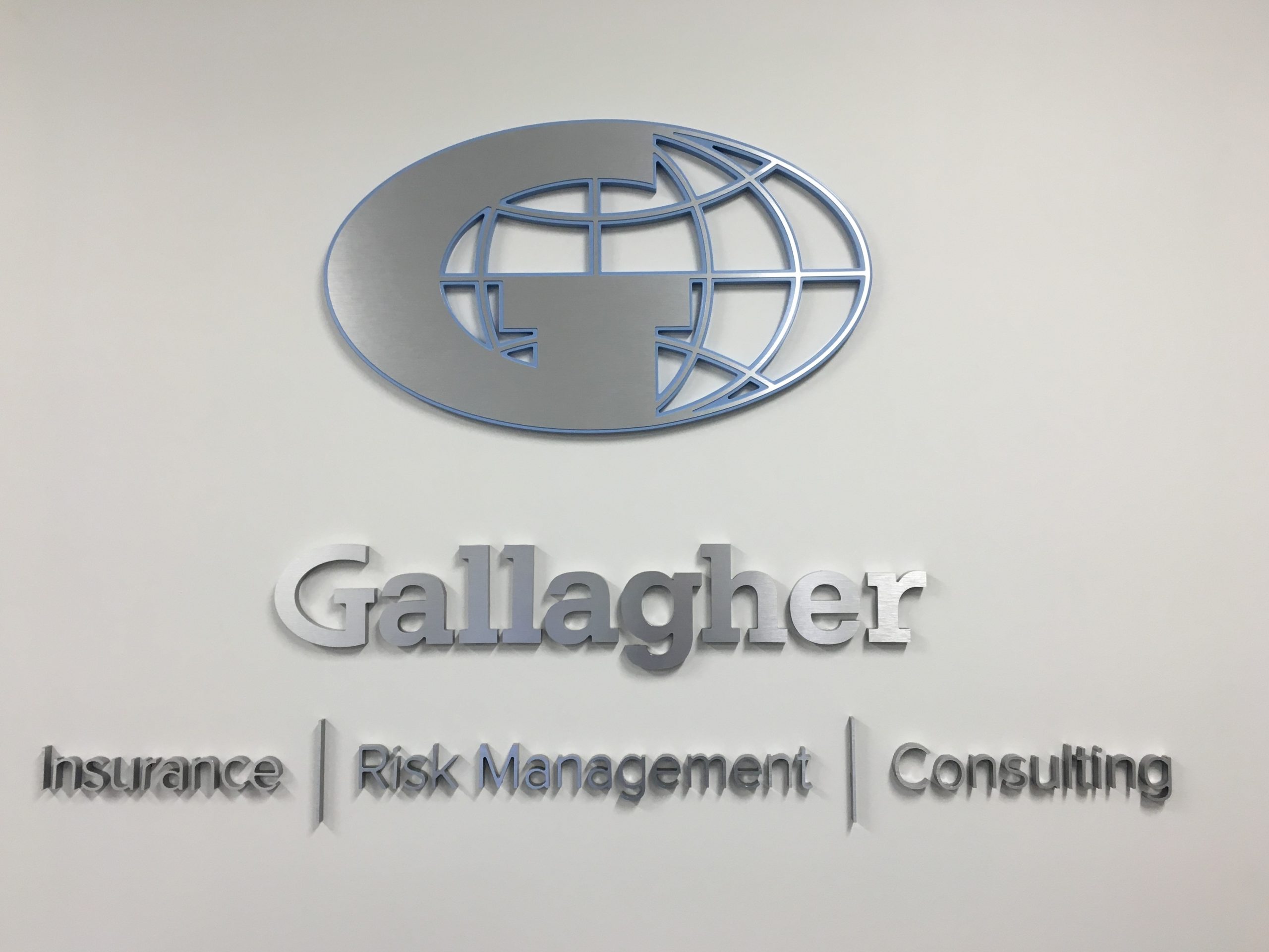
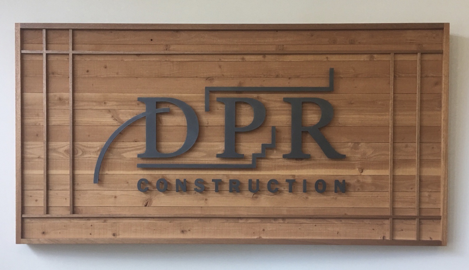
The more common materials used for lobby signs are Stainless Steel (FCO or formed) which has been quite popular for decades. It’s durable, timeless, and has an apparent “expensive” quality. Acrylic panels and stand-off hardware are also very common. They allow for added visual depth and light play (polished edges reflect, letters cast shadows) while giving a visual/physical frame to the sign by allowing the background surface to remain visible. Depending upon the budget and desired curb appeal, acrylic or foam are budget-friendly options for FCO lettering. Pre-finished laminates in Aluminum, HPL or polymer (i.e. – “Formica”, “WilsonArt” or similar) can be added to most of the above for the appearance of other more expense materials. Making lettering from wood, for example, might not be suited to a complex logo shape, but an acrylic letter might achieve a wood look with an HPL laminate on top and still be able to be cut on a laser or CNC. Digital print (to vinyl or direct to substrate) can be used for complex images (photos, gradients) or when a non-dimensional element is needed.
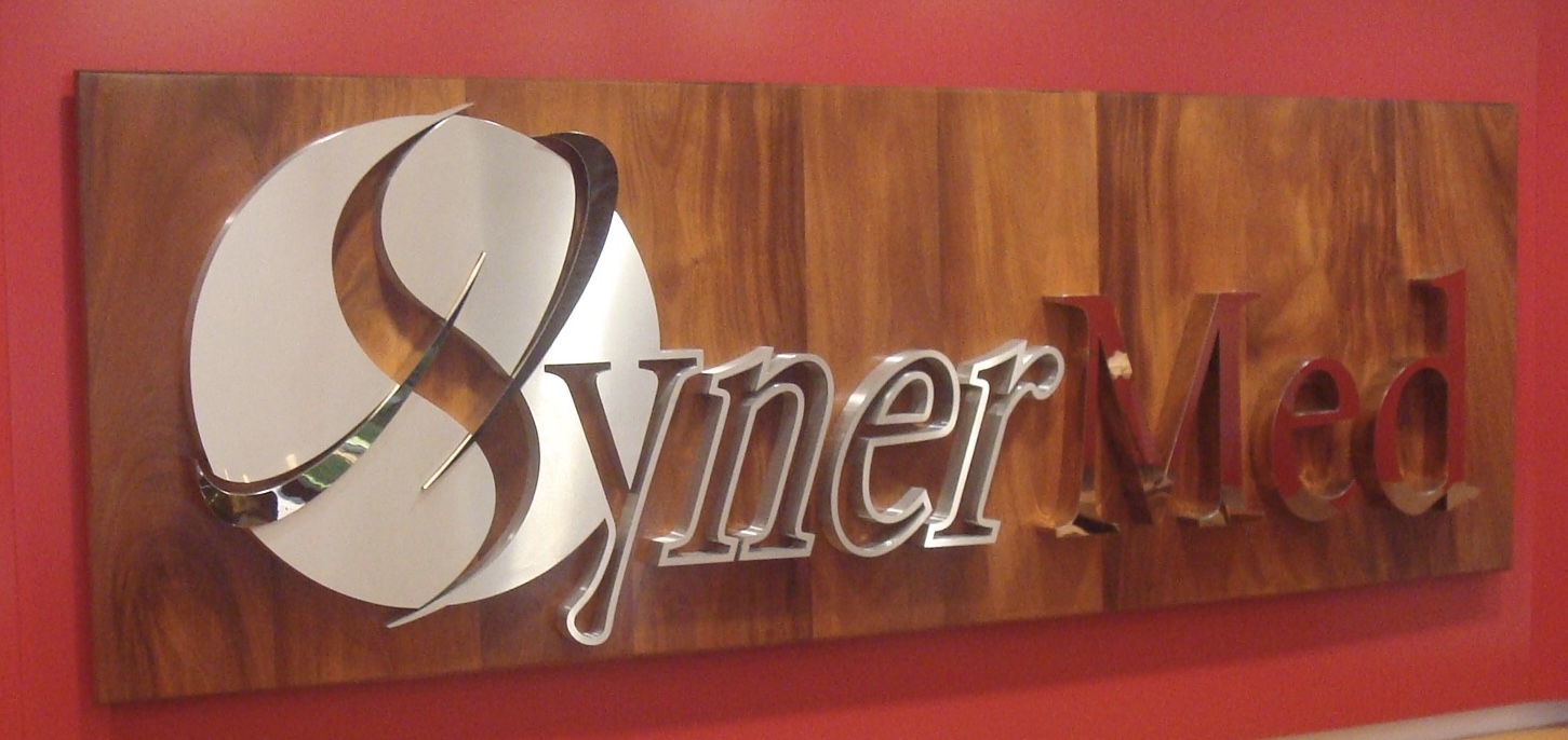
To fabricate some of the more complex or higher end solutions stainless steel can be augmented with color tinting to mimic the look of gold or polished to resemble silver. In the place of acrylic, glass can often be used. Natural materials like granite and hardwood add a touch of class and style. Custom hardware solutions like LED-illuminated stand-offs, edge-grips, or cable systems also elevate curb appeal. Metals and illumination are often chosen for high end applications.
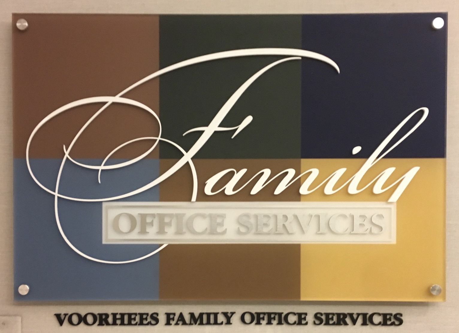
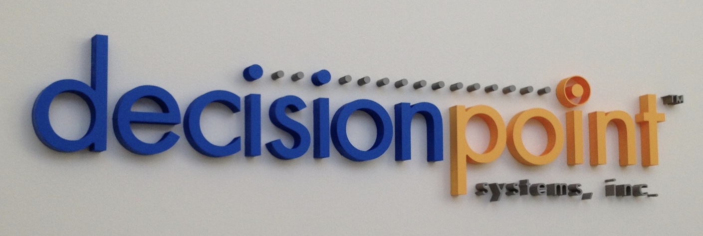
In essence, all signs are three-dimensional however, there are methods for adding depth that bring added advantages to the look and appeal of signage. Budget and perceived value for these options is always going to drive client decisions. Various techniques and layering of different materials can achieve a three-dimensional effect. Edge treatments can create an illusion and increase the visual impact of depth. Thicker materials will impact weight which alters installation methods and hardware needs, or foam can be used as a light substitute. There is also the option of three-dimensional modelling and carving of logos and/or images. Paint finishes or digital prints can be utilized to add highlights, shadows add the illusion of dimensionality. If the wall space is small, then adding dimensional graphics really helps bring the design to life.
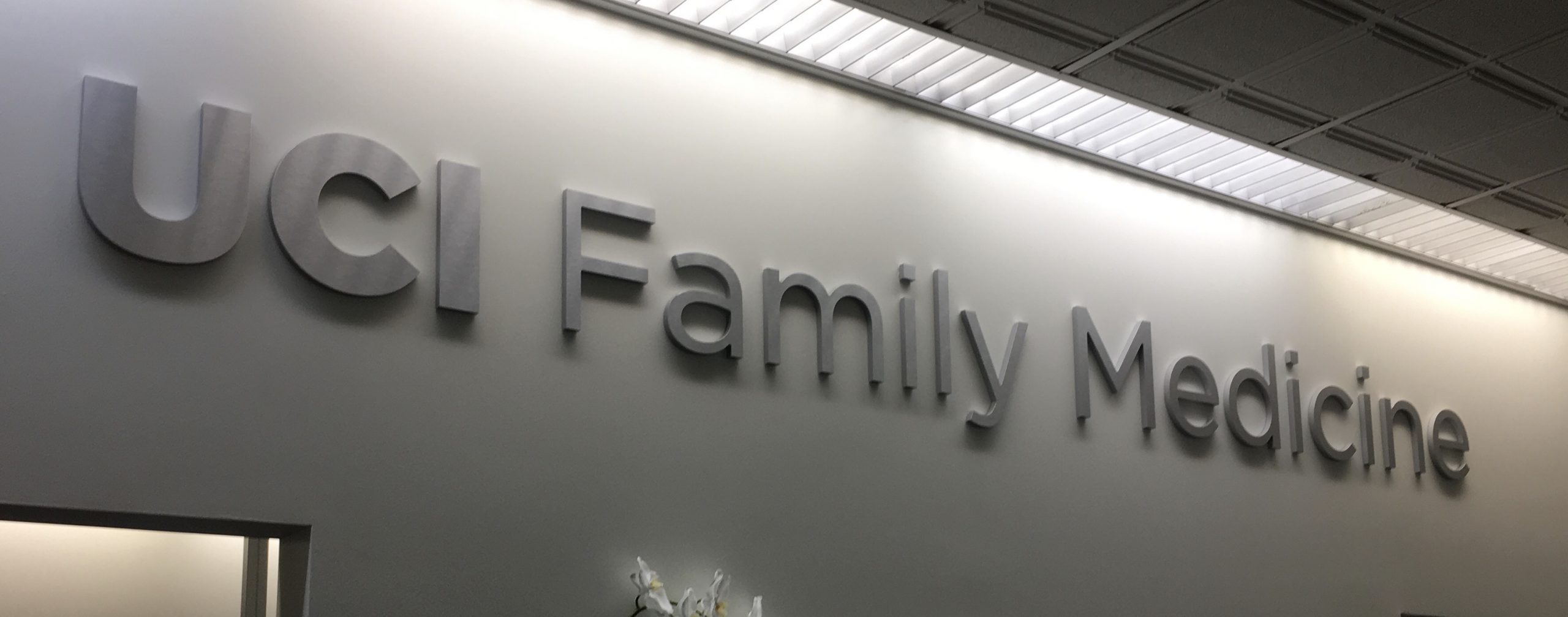
Illuminated signs are best suited to larger interior wall surfaces. Smaller surfaces are overwhelmed by illuminated signs. To justify illumination, it is necessary to evaluate budget and other factors that will impact the overall project cost like, is electrical available and/or can it be brought easily to the location? Is the logo suited to fabrication methods used for illuminated signs? Does the lighting and décor of the space itself lend itself to illuminated signage? If the wall surface is dark or busy (a digitally printed wallcovering was used) or the ambient lighting is low, illuminated lettering might be a great option. Given the right backer, illuminated letters can stand out even in a brightly lit lobby.
Clients select illuminated signage because it speaks to “expensive” and leans towards modern. There has been an increase in illuminated lobby signs over the past few years, but it’s still much more rare than more traditional methods which can be attributed this mostly to the cost. Illuminated signs are considerably more expensive when you add in electrician and potentially wall remodeling fees and only comprise 5% of the overall marketplace.
The simplest sign could be hundreds of dollars, while a large, ornate, and complex one could get into the thousands or perhaps even the tens of thousands. Illuminated signs (themselves) cost 3 to 6 times as much as non-illuminated signs. With additional fees to contractors, the overall cost could be 5 to 10 times as much.
Beyond what has been mentioned, factors that drive pricing for Lobby/Reception signs includes, the logo or wording complexity, quantity of colors or materials employed, physical size and techniques employed are the main drivers. Labor and fabrications costs are determined by the number of steps, processes and machines used. The number of components, and the overall weight add to the installation hardware, and time required.
It’s challenging for clients to do a fair comparison between signage vendors when making a selection on something as “personal” as a branding piece for a lobby. Something as simple as the fact that acrylics must be laser cut will be an unknown to an uninformed client. A signage partner should be selected based upon their experience producing the desired sign type. This is your brand, and it must be as impactful as possible. Quality is everything and little finishing touches matter! How laminates are applied, what’s done to the edges or returns, how fine the detailing is in the print that’s applied, all influence the finished outcome, and ultimately, the perceived quality of the brand the sign represents. With as many variables as there are in materials, techniques, equipment, and the like, it’s almost never an “apples to apples” comparison even when working off the same sets of drawings. Three different sign companies will yield very different results.
